Articles > Web Development Tutorials
CSS grid is a powerful layout system that allows web designers to create two-dimensional layouts with precise control over content placement and alignment. With CSS grid, designers can easily create complex and flexible layouts without the need for additional frameworks or plugins.
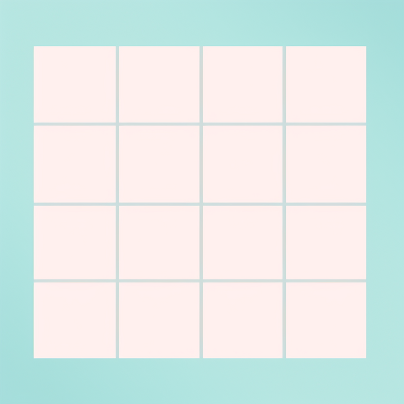
One of the key benefits of using CSS grid in web design is the ability to effectively organize content into rows and columns. This allows for a structured and balanced layout, ensuring that the content is well-organized and visually appealing. By defining rows and columns, designers can easily position elements within the grid, ensuring that they are aligned perfectly.
Moreover, CSS grid provides designers with precise control over content placement. Designers can specify the size of each row and column, as well as adjust the spacing between them. This level of control enables designers to create pixel-perfect designs, ensuring that elements are aligned perfectly and positioned exactly where they want them to be.
In addition, CSS grid allows for responsive design, meaning that the layout can easily adapt to different screen sizes and devices. Designers can establish breakpoints, where the design adjusts to accommodate smaller screens or changes orientation. This means that the same design can be easily scaled and viewed on different devices, without sacrificing the integrity of the layout.
Overall, CSS grid provides web designers with a powerful and flexible tool to create beautiful and well-organized layouts. Its ability to create two-dimensional layouts and offer precise control over content placement make it an essential part of modern web design. By leveraging the capabilities of CSS grid, designers can easily create visually stunning and responsive websites.
Mastering CSS grid layouts is crucial for web design as it offers numerous advantages over other layout systems. CSS Grid provides a powerful and flexible way to create complex and responsive layouts for websites. It allows designers to position elements in both rows and columns, providing precise control over the placement of content.
One of the major advantages of CSS Grid is its ability to create visually appealing layouts. Designers can easily align elements, manipulate dimensions, and define spacing, resulting in a clean and organized design. With CSS Grid, web designers have the freedom to experiment with different layouts and create unique and eye-catching designs.
CSS Grid also offers superior responsiveness compared to other layout systems. It enables designers to create layouts that adapt seamlessly to different screen sizes and resolutions. By defining grid templates and using media queries, designers can ensure that their designs are optimized for various devices, including desktops, tablets, and mobile devices. This flexibility allows for a consistent and user-friendly experience across different platforms.
Mastering CSS Grid layouts is essential for web designers who want to stay relevant and provide the best user experience. Its ease of use and flexibility make it a must-have skill in today's web design industry. By harnessing the power of CSS Grid, designers can create visually stunning and responsive layouts that enhance the overall quality of a website.
CSS Grid Layout is a powerful tool for creating two-dimensional grid-based layouts in web design. It allows developers to create complex and responsive layouts with ease, providing flexibility and control over the placement and alignment of elements on a web page. By dividing a web page into rows and columns, CSS Grid Layout offers a more intuitive way to design and structure content, eliminating the need for complicated positioning techniques and float-based layouts. In this article, we will explore the key concepts of CSS Grid Layout, including grid containers, grid items, grid tracks, and grid lines, as well as the various properties and functions that can be used to manipulate and control the grid. Whether you are new to CSS Grid Layout or looking to enhance your skills, understanding these core concepts is essential for creating modern and dynamic web layouts.
Grid containers and items are essential concepts in CSS Grid, allowing for the creation of grid layouts and organization of child elements.
A grid container acts as a parent element that contains grid items. It defines the context in which the grid layout is applied. By declaring a container as a grid, you can divide its content into a series of rows and columns, creating a grid-like structure. The container establishes the grid's dimensions, gap sizes, and alignment properties.
Grid items, on the other hand, are the child elements of the grid container. They are the individual components that populate the grid. Items can be placed in specific cells within the grid, spanning multiple cells, or automatically placed based on the grid's defined rules.
To create a grid container, the display property is used with the values grid or inline-grid. When set to grid, a block-level grid container is created. This means that the grid occupies the entire width of its parent container. Conversely, when set to inline-grid, an inline-level grid container is created, allowing it to flow along with other inline elements.
In conclusion, understanding grid containers and items is crucial in harnessing the power of CSS Grid. The container defines the grid layout, while the items fill the grid, organizing child elements in a flexible and efficient way.
A grid container is a fundamental component of CSS Grid Layout that allows developers to create grid-based layouts. It serves as the parent element that contains the grid items, which are the child elements organized within the grid structure.
The main role of a grid container is to establish a grid formatting context. This means that any direct child elements within the grid container are automatically treated as grid items, and their layout and positioning is governed by the grid layout rules specified by the developer. The grid formatting context allows for precise placement of elements within the grid, enabling complex and versatile layouts.
To create a grid container, the display property is used with the value grid or inline-grid. When set to grid, a block-level grid container is created, meaning that it takes up the entire horizontal space of its parent container. On the other hand, when set to inline-grid, an inline-level grid container is created, allowing it to be placed alongside other inline-level elements.
In summary, a grid container is a parent element that establishes a grid formatting context, organizes child elements into a grid structure, and serves as the container for the grid items. It is created using the display property with the value grid or inline-grid, allowing for the creation of powerful and flexible grid layouts in CSS.
Grid items and grid cells are two key concepts in CSS grid layout, but they should not be confused with each other. While both terms refer to components within the grid layout, they have distinct roles and characteristics. A grid item is any element that is a direct child of a grid container and is placed inside the grid tracks defined by the grid. These items can span across multiple tracks and can be positioned and sized using various grid properties. On the other hand, a grid cell refers to the individual unit within the grid, which is typically a single cell created by the intersection of a row and column. Each grid cell can contain one or more grid items, and by default, they are automatically created by the grid container. Understanding the difference between grid items and grid cells is crucial for effectively utilizing the power and flexibility offered by CSS grid layout.
CSS Grid Layout is a powerful system for creating two-dimensional grid-based layouts in CSS. It provides a set of grid properties that allow granular control over the placement and sizing of elements within a grid.
The grid properties, such as grid-row and grid-column, allow you to define the span and placement of elements within a grid. For example, the grid-row property specifies the starting and ending line numbers for the element's rows, while the grid-column property does the same for columns. By using these properties, you can easily create complex grid layouts with precise control over the position and size of each element.
In addition to specifying line numbers, CSS Grid also supports named columns. Named columns are an alternative way to define the grid's columns using human-readable names instead of line numbers. This makes the code more readable and maintainable, as it allows you to reference columns by name rather than remembering line numbers.
One of the main benefits of using CSS Grid Layout over other layout systems is its flexibility. It allows you to create grid-based layouts that adapt to different screen sizes and orientations without the need for media queries or JavaScript. Moreover, CSS Grid Layout provides a simplified syntax and a more intuitive way of creating complex layouts compared to older layout systems like float-based layouts or inline-block grids.
In summary, CSS Grid Layout provides grid properties and control that enable precise placement and sizing of elements within a grid. These properties, such as grid-row and grid-column, can be used to define the span and placement of elements. The concept of named columns makes the code more readable and maintainable. CSS Grid Layout also offers benefits such as flexibility and a simplified syntax, making it a powerful tool for creating modern, responsive layouts.
Grid properties such as grid-template-columns and grid-template-rows are essential in specifying the layout of a grid. These properties allow web developers to define how many columns and rows a grid should have, and the width or height of each column or row.
The grid-template-columns property is used to define the width of each column in the grid, while the grid-template-rows property is used to define the height of each row. The values for these properties can be specified in pixels, percentages, or using the new fr unit, which represents a fraction of the available space in the grid.
To combine these properties, the shorthand grid-template can be used. This property allows developers to specify the rows and columns of the grid in a single declaration. For example, grid-template: 1fr 2fr / 100px 200px defines a grid with two rows, the first row takes up 1 fraction of the available space, the second row takes up 2 fractions, and two columns, the first column is 100 pixels wide, and the second column is 200 pixels wide.
Named columns provide an alternative way to define the grid layout. Using grid-template-areas, developers can assign names to different parts of the grid and then use these names to structure the layout. For example, grid-template-areas: "header header" "content sidebar" "footer footer" defines a grid with three rows and two columns, where the header, content, and footer areas span across both columns, and the sidebar area occupies the second column.
In conclusion, grid properties such as grid-template-columns, grid-template-rows, and grid-template allow precise control over the layout of a grid. Adding named columns using grid-template-areas provides an intuitive and flexible way to organize the grid's content.
Grid properties are an essential aspect of web design, allowing designers to have precise layout control over their websites. By understanding and effectively applying grid properties, designers can achieve specific design outcomes and create visually appealing websites.
One key concept to grasp when using grid properties is the grid container. This is the parent element that holds all the grid items. To create a grid container, simply set the display property to "grid" or "inline-grid" on the parent element. Once the container is established, designers can select properties such as "grid-template-columns" and "grid-template-rows" to define the number and size of the grid tracks, which are the columns and rows that make up the grid.
To achieve precise layout control, designers can use properties like "grid-gap" or "grid-column-gap" to determine the spacing between grid items. Additionally, the "justify-items" and "align-items" properties allow designers to align items within the grid container horizontally and vertically, respectively.
Understanding grid properties is vital in achieving specific design outcomes. They provide a way to create organized and structured layouts, ensuring elements are aligned in a visually appealing manner. For instance, designers can use grid properties to create a responsive design, easily adapting the layout to different screen sizes.
To apply grid properties effectively, designers should first plan their desired layout, considering the number of columns and rows needed. They can then use the specified grid properties to achieve their desired design outcome.
In conclusion, grid properties play a significant role in achieving precise layout control. By understanding and effectively applying these properties, designers can create visually appealing and organized layouts, resulting in aesthetically pleasing websites.
In today's digital age, it is crucial for websites to be adaptable to different screen sizes and devices. One effective approach to achieving this responsiveness is by using grid layouts. Grid layouts provide a systematic way to structure content, allowing for an organized and user-friendly design. They consist of multiple columns and rows, which can be adjusted to accommodate different screen widths. In this article, we will delve into the process of creating responsive grid layouts and explore the key aspects to consider when implementing them. From defining breakpoints to using CSS media queries, we will cover the essential techniques to ensure a seamless user experience across devices. Additionally, we will discuss the importance of optimization, accessibility, and scalability in grid layouts, showcasing how they can enhance performance and usability. Whether you are a web developer or designer, mastering the art of creating responsive grid layouts is essential for building modern, adaptable websites. With the following guidelines, you will be equipped to create stunning and effective grid designs that seamlessly respond to different devices and screen sizes.
To optimize the display of the "Featured Product" section for smaller screen sizes, we can add a responsive breakpoint and utilize a media query to target screens with a maximum width of 868 pixels or less.
Firstly, we need to specify the responsive breakpoint in the CSS code. This is typically done by using the `@media` rule followed by the desired maximum width. In this case, we set the breakpoint to 868 pixels with `@media screen and (max-width: 868px)`.
Once the breakpoint is set, we can adjust the layout, spacing, and width of the section to ensure it stacks vertically and takes up the entire available space. This can be achieved by modifying the CSS properties of the elements within the section.
For example, we can change the width of the featured product container to `100%` to ensure it takes up the entire width of the screen. We can also remove any floating or positioning properties that may be preventing the section from stacking vertically.
Additionally, we may need to adjust the spacing between the elements within the section to maintain a visually pleasing design. This can be done by modifying margins or padding values as necessary.
By implementing a responsive breakpoint and making these layout adjustments, the "Featured Product" section will dynamically adapt to smaller screen sizes, providing an optimal display experience for users on mobile devices or screens with limited space.
Responsive layouts are an essential aspect of modern web design that cannot be overlooked. In an era where people access websites from various devices with different screen sizes, ensuring a seamless user experience across all platforms has become crucial.
The importance of responsive layouts lies in their ability to adapt and adjust to different screen sizes. With a responsive design, websites can seamlessly scale and adjust their content to fit perfectly on any device, whether it is a large desktop screen or a small mobile phone screen. This ensures that users can access and navigate through the website easily, without having to constantly zoom in or scroll horizontally to view the content.
By providing a consistent user experience across different devices, responsive layouts play a significant role in improving user satisfaction. Users no longer need to switch between devices to access a website optimally; they can access it from any device and still enjoy a smooth and visually pleasing experience.
Responsive layouts can be achieved using CSS Grid and media queries. CSS Grid enables web designers to create flexible and responsive grid layouts that automatically adjust to different screen sizes. Media queries, on the other hand, allow designers to apply specific styles to different devices based on their screen width, height, or orientation.
In conclusion, the importance of responsive layouts in modern web design cannot be understated. They not only improve user experience but also contribute to a website's overall success in today's mobile-driven world. With the use of CSS Grid and media queries, achieving responsive layouts has become more accessible, enabling designers to create websites that are visually appealing and accessible across all devices.
CSS grids are a powerful tool that can greatly assist in creating responsive designs. With the ability to easily divide a webpage into rows and columns, CSS grids provide a flexible and intuitive way to structure content and adjust layouts depending on the screen size or device being used. By using grid properties such as grid-template-rows, grid-template-columns, and grid-gap, designers can control the placement and spacing of elements within the grid. CSS grids also support responsive design by allowing the grid to change its layout based on media queries or viewport breakpoints. This enables designers to create fluid and adaptive layouts that automatically adjust to different screen sizes, without the need for complex calculations or reliance on frameworks. Whether it's a simple blog layout or a complex e-commerce website, CSS grids offer a straightforward and efficient solution for creating responsive designs.
Screen sizes and breakpoints are fundamental elements in designing responsive websites. With the increasing variety of devices used to access the internet, ensuring optimal user experience across different screen sizes has become crucial.
In web development, three common screen sizes are typically considered: desktop, tablet, and mobile. Desktop screens tend to be larger, with higher resolutions and more visible content. Tablet screens are smaller than desktops but larger than mobile screens, providing a medium-sized viewport for users. Mobile screens are the smallest and require a simplified layout to accommodate their limited space.
Breakpoints are specific screen widths at which a website's layout changes to adapt to different screen sizes. They act as triggers for applying different design rules and optimizations. For instance, when a website is viewed on a desktop with a width above a certain breakpoint, the layout might feature multiple columns and detailed navigation. However, when viewed on a mobile device with a width below a certain breakpoint, the layout might transform into a single-column design with larger touch-friendly buttons.
Designing responsive websites requires careful consideration of these screen sizes and breakpoints. By designing layouts that adapt to various screen sizes, designers can ensure that their websites deliver a consistent and intuitive user experience across different devices, improving usability and engagement.
When designing with CSS grids, it is crucial to consider various screen sizes. With the ever-increasing number of devices with different screen sizes and orientations, it is important to ensure that your website or application adapts seamlessly to these variations.
CSS grids offer a powerful layout system that allows for flexible and responsive designs. By using CSS grid properties, such as grid-template-columns and grid-template-rows, you can create a grid structure that adjusts and rearranges itself based on the available space.
However, the adaptability of CSS grids goes beyond that. By incorporating CSS media queries, you can further enhance the responsiveness of your design. Media queries allow you to apply different styling rules based on the characteristics of the device, such as screen size, orientation, or resolution.
Using media queries in combination with grid properties enables you to create tailored layouts for different screen sizes. For example, you can define a three-column grid for larger screens, but change it to a single-column grid for smaller screens to ensure optimal readability and usability.
Considering various screen sizes and utilizing CSS grids with media queries not only improves the user experience but also future-proofs your designs. As new devices with different screen sizes continue to emerge, your website or application will be able to adapt effortlessly, providing a consistent and optimized experience for all users.
 Author: Guava AU